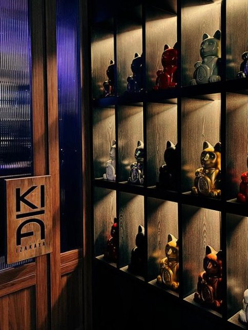
Ki Izakaya
Transformation of a snug terrace cafe into a classic izakaya restaurant and bar
Kempinski Hotel, Lang Suan, Bangkok
For Sindhorn, and Hot Potato Hospitality
2021
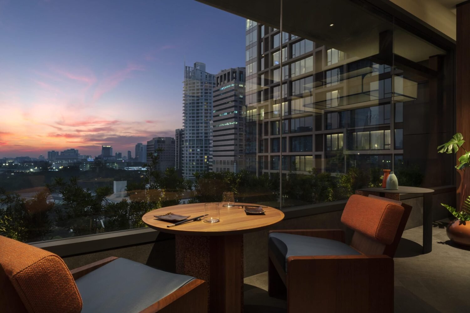
In 2020 the Sindhorn Kempinski set a new standard for urban resort hotels in the heart of Bangkok's Lumphini Park neighborhood. A year after the hotel opened, the izakaya Ki introduced a traditional Japanese style “drinking restaurant.” Here a buzzing social atmosphere and fresh geometric design style brings a warm and free spirited contrast to the cool-toned classic luxury celebrated elsewhere on the property.
This project is somewhat unique among our design work in that it was a rapid-fire refit of an existing space. In collaboration with Shane Giles and Blue Salt, Atelier Pond developed concept, planning, detailed custom furniture, and materials, with the owners enlisting a local firm to oversee construction thereafter.


Chic & cheerful
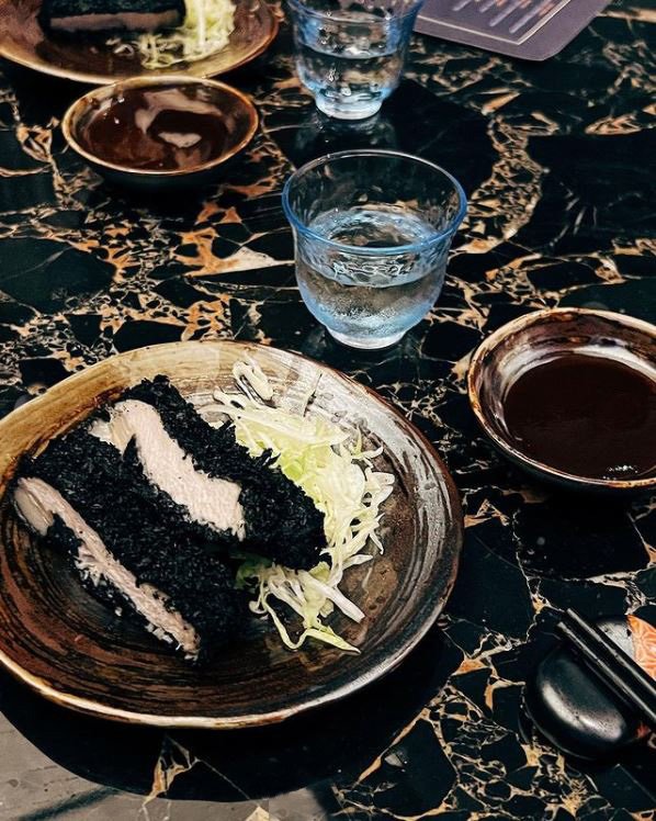
In the case of Ki, where a quick “flip” of an existing restaurant space was needed, it was a pleasure and a boost to work within the confines of a well worn format like the izkaya. Whether or not our project followed the full playbook of tatami seating, loud music, smoky dimly lit spaces and raucous greetings, we savoured the reliable aspects of small plates of grilled meats and veggies alongside generous servings of beer and cocktails, enjoyed in a communal den-like space.

an evening at Tatemichiya, the “punk rock izakaya” inspired our conversations around service, experience and design
As part of an earlier research trip to Tokyo we visited one of the landmarks of izkaya-dom, the Daikanyama “punk rock izakaya” Tatemichiya. In a basement space of similarly cozy proportions, with a layout similarly crowded around a station that is at once DJ deck, drinks bar and chef’s table, we experienced the essential details that led us to the core elements of the Ki design. We took away these essentials:
A ‘high art’ respect for humble foods
An atmosphere of generosity and connection
Service like celebration
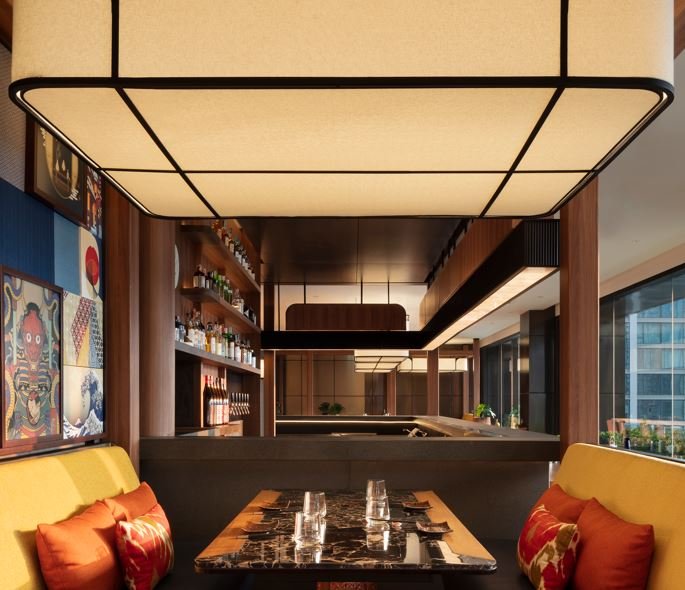
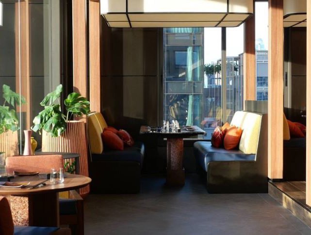
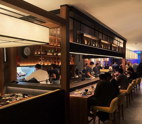
With these basics in mind we set to work on a swift rethink of the space: leaving the bar and back of house exactly in place, down to the lighting, turning the drinks bar counter into a chef’s table with strategic addition of a lower dining counter, adding six-person pavilions to buffer the harsh grey stone interior with layers of warm wood and details, and keeping the tables along the panoramic window low and extra kawaii, bringing everyone closer to the expansive city view.
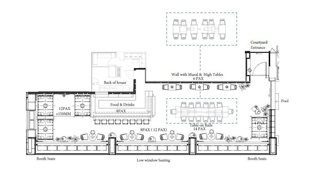
the Ki layout strategy prioritizes engagement with the bar, the city view or within separate groups of diners
A variety of table heights and group sizes helps uphold the hum of social interaction and see-and-be-seen views

The essential elements for our bar transformation, which turned a banal pool bar into an engaging izakaya chef table
In our development of conceptual foundations, we looked to the colorful and hyper-modern traditions of graphic design and commercial art in 1960’s Japan. Like a hyper-active reinterpretation of the DeStijl movement, the bold colors and pure geometries of this era in Japanese graphics was nonetheless recognizable as uniquely Japanese in character. The colors and shapes we found in our research led us to the “elegant chunk” style of furniture we explored in all of the seating, pavilions and fixturing.

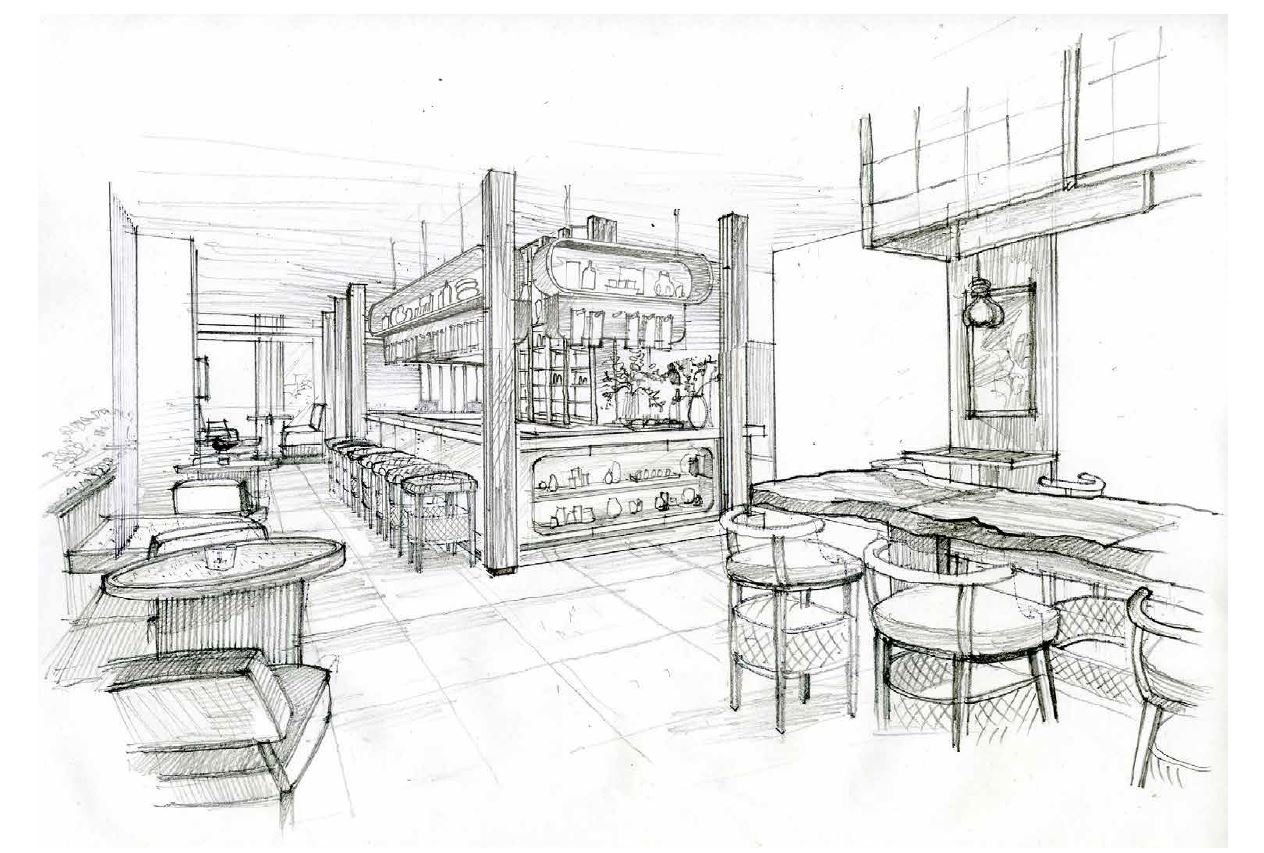
Some of our early “elegant chunk” studies in form and material. Our lightweight documentation consisted mainly of presentation style detail drawings like these, a few sheets containing all the essentials of the design.
The Before Times
While it certainly had a thoughtful place in the original hotel masterplan, we delight in sharing this image of the space as we found it as our project began. While, with your eye blurred, this essay in greys might look ironically a bit like the bubble-era hotel bars of Shinjuku, it’s worth noting the drastic change in tone that was achieved wholly through the addition of furniture, millwork and decorative light fixtures. Even the over-bar structure remained untouched, with the new earthier shelving riding on the existing fixture.

The Ki space in 2021 before our work began. The redesign was a cost-effective strategic retrofitting, avoiding any demolition.